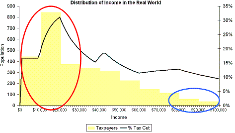
Let’s have another look at our friend, the distribution of income graph. The red circle is what most people earn. The blue circle is where you would think most people earn given the commentariat’s fixation with the 39% bracket.
No prizes for guessing which circle editors and opinion writers fall into, eh?
You’ll also note that the largest percentage tax reduction in tax goes right to the bulk of the population. In fact, Keith Ng at Public Address has done a brilliant analysis showing that the tax cuts undo fiscal drag for all incomes above $47K and the 70% of people whose incomes are lower than that will be getting a tax cut that goes well beyond making up for fiscal drag.
Powered by WPtouch Mobile Suite for WordPress