Let’s recap here. Labour, according to the polls, is anywhere from 6 to 18 points behind National. Even accounting for the quirks of MMP it’ll be a bloody hard slog to retain power and, more importantly, keep the Tories from the Treasury benches. Labour’s campaign has got to be an absolute killer.
And then they come up with this.
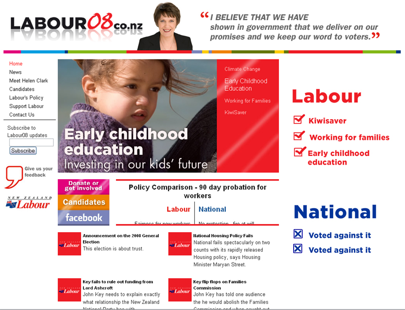
For a start, it’s way too busy. The flashing images are headache-inducing. Labour’s colour is red, not white. The clashing rainbow colours at the top are stupid and distracting. The press releases are already out of date. The site crashes in Firefox. Until yesterday the donations page was broken. The text on policy comparisons runs over the box. The mirrored Labour08 text at the top looks like something out of a fourth form design class. Even the picture of Helen Clark is far too intense, and the way it’s cropped she looks like she’s topless under that black vest.
Sure, a bad campaign website’s not the end of the world, but if it’s a sign of things to come then I’m deeply concerned. If Labour wants to win in ’08 they’re going to have to do a lot better than this.
[Hat tip: DPF]
Powered by WPtouch Mobile Suite for WordPress