Now, yesterday a couple of righties didn’t want to believe the evidence in front of their eyes that the GDP per person gap between Australia and New Zealand doubled during the neoliberal economic revolution. They got upset at my conclusion that repeating those same policies (which is what Don Brash’s 2025 Taskforce will inevitably recommend) would, therefore, be pretty dumb if the aim is to catch up to Australia’s income levels.
‘Pfff’, they said ‘GDP per capita what’s that? Only the premier measure of the amount of economic activity per person in a country. We refuse to accept that as evidence of the income gap and demand more indicators.’ Well, the advantage of writing for a blog that has been covering these issues in depth for nearly two years, is I can easily oblige:
(source: Treasury)
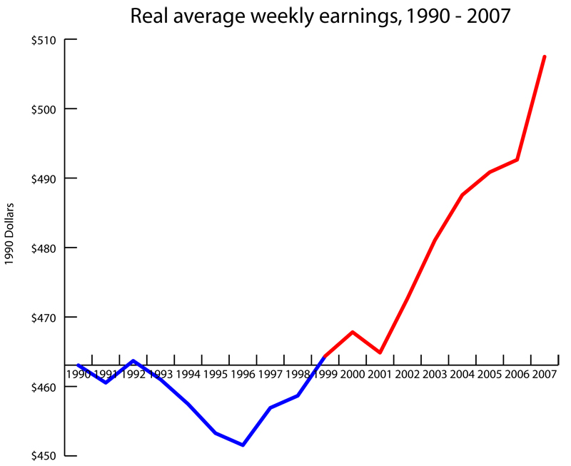
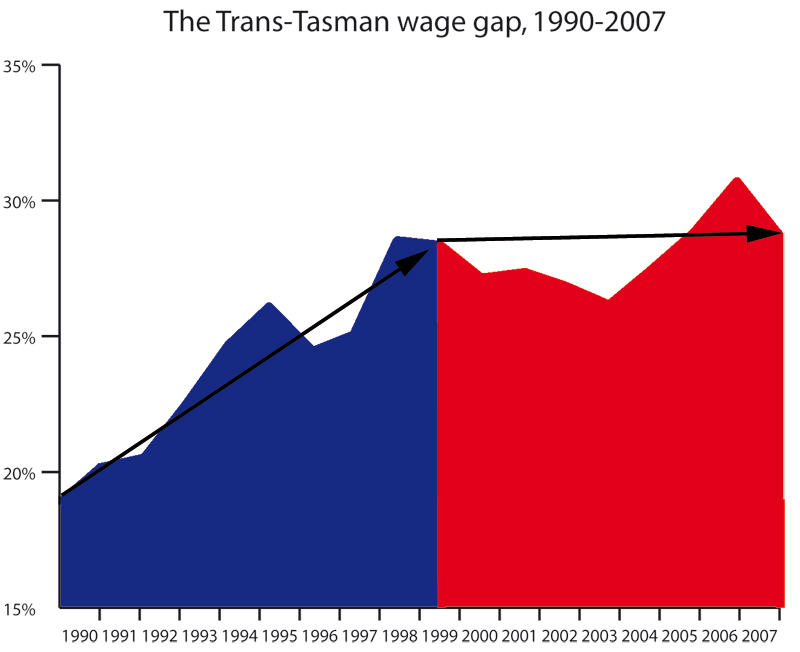
Now, obviously the wage gap is most pertinent, showing massive growth during the second half of the neoliberal revolution, but the others show how that came about: lower wages in NZ, a lower share of GDP for Kiwi workers. There are plenty more graphs in the archives showing things like how the poorest 40% of Kiwis got poorer in real terms between 1998 and 2001, while they enjoyed the largest percent gains in wealth under Labour, how National let the minimum wage fall, how median hour earnings fell with the introduction of neoliberalism. There’s a real treasure trove in there for anyone looking to get informed – the wages and workers’ rights categories especially.
Powered by WPtouch Mobile Suite for WordPress